Latest News + Blogs
The world's most talked-about music news and blogs, sorted.
The Smashing Pumpkins Announce New Guitarist Kiki Wong
5 hours ago

Stereogum —
This summer, the Smashing Pumpkins will head out on a gigantic stadium tour with Green Day and Rancid. It’s their highest-profile tour in a very long time, and they’ll do it without guitarist Jeff Schroeder, who joined the band in 2006 and left last year. In January, the Smashing Pumpkins posted a wanted ad for a new guitarist, and more than 10,000 people applied for the position. The band reviewed the submissions and held in-person auditions in Los Angeles. Today, the band announced that LA shredder Kiki Wong will join them on the road. more info
R. Kelly’s Child Pornography Conviction Upheld in Chicago
3 hours ago

Consequence Of Sound — The disgraced singer's 20-year prison sentence was affirmed by a three-judge appeals panel.
R. Kelly’s Child Pornography Conviction Upheld in Chicago
Paolo Ragusa
more info
Eminem’s new album announcement is worrying fans: ‘The end of his rap career’
3 hours ago

New York Post — Emimem has announced his 12th studio album coming this summer, and its title is making fans worried. more info
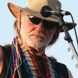
Willie Nelson – “Made In Texas”
3 hours ago
Stereogum —
In the past few weeks, 91-year-old legend Willie Nelson appeared on new records from Beyoncé and Orville Peck. This summer, he’ll embark on another edition of his touring Outlaw Music Festival, where mythic figures like Bob Dylan and Robert Plant will open for him. Next month, Nelson will release The Border, which is being billed as his 75th album of new material. We’ve already posted the grave, powerful title track, and now Nelson has shared a very different single. more info
Inter Arma Go All Nick Cave On Their New Album Closer “Forest Service Road Blues”
3 hours ago

Stereogum —
Today, Richmond underground metal lifers Inter Arma release New Heaven, their first album of new material in five years. All the advance singles — the title track, “Concrete Cliffs,” “Desolation’s Harp” — were titanic, and I kept meaning to listen to the advance stream of the full album, but I guess I never got around to it. Maybe that’s why I was so surprised when I played the record today and the last track came in. more info
Watch SLIPKNOT's Entire Californian Club Show From The Front Row
4 hours ago

Metal Injection — Casagrande-knot goes hard. more info

Watch Danielson’s “Come And Save Me” Video Starring Fred Armisen
4 hours ago

Stereogum —
For the 2021 movie Electric Jesus, about a fictional ’80s religious metal band called 316, Daniel Smith of the quirky Christian underground rock band Danielson wrote a bunch of fake Christian hair metal songs. The film’s soundtrack also included “Come And Save Me,” an epic eight-minute Danielson song in the band’s usual theatrical indie-pop style (i.e. more like Danielson pal Sufjan Stevens’ early work, not like the hair metal pastiche of 316). “Come And Save Me” uses lyrics penned by Larry Norman, the cult-favorite Jesus People singer-songwriter whose rapture ballad “I Wish We’d All Been Ready” has been covered by artists like DC Talk and Jordin Sparks. more info
Popular artists in music news and blogs
The most hyped artists in the world right now.


